


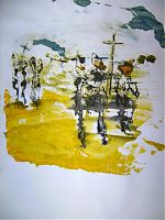


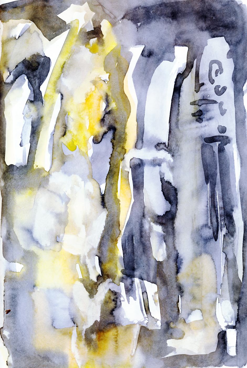
Blue sketchbook sheet 25
Datum
![]()
![]()
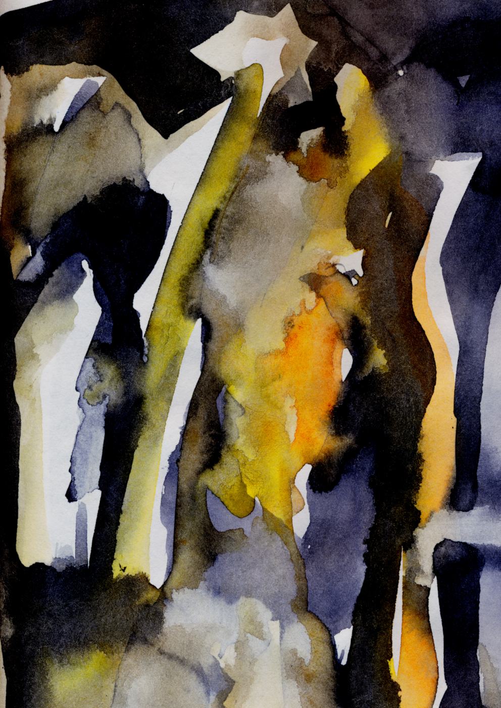
Richscribble
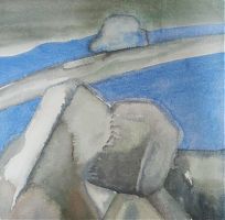
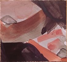
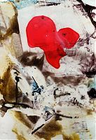
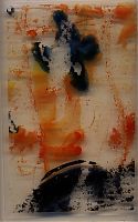
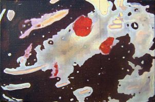
Blatt 31 aus dem blauen Skizzenbuch, Richscribble-Aquarell, Zülpich 2023
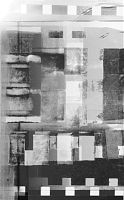
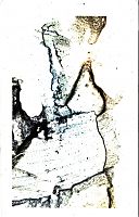
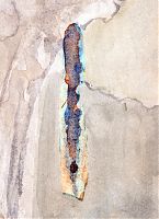
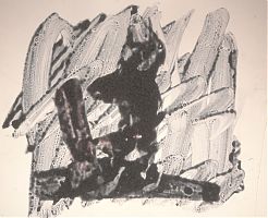
This pale sheet from the blue sketchbook contains some beautiful artifacts. First, I edited the original scan with a white balance adjustment.

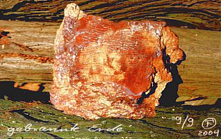
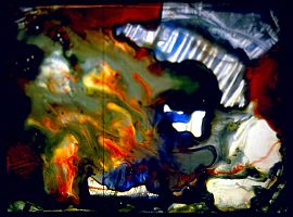
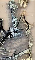
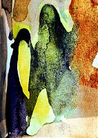
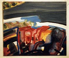
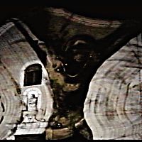
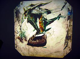
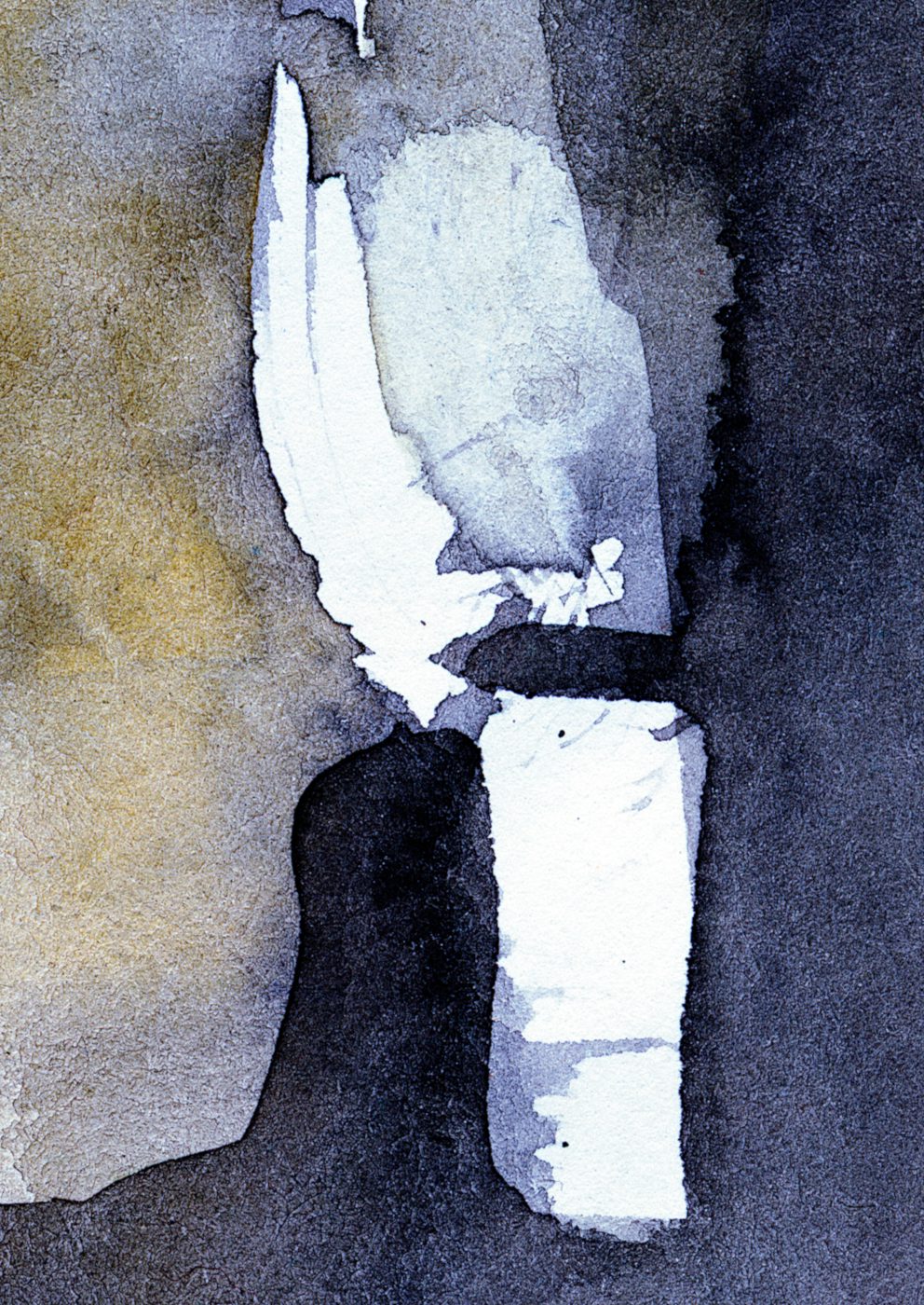
The third image shows the original after color matching. From this version, I isolated a coherent region with all its structures and artifacts and processed it as a giclée print.
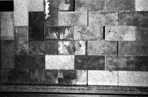
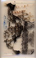
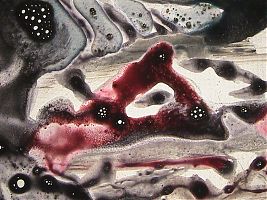
To achieve this, I adjusted the color values more clearly, saturated them, and added a touch more contrast. This has made it deeper and more powerful without it becoming childishly colorful. This print in DIN A1/A2/A3 formats can give a room that is too calm and boring an eye-catching focal point. In more exciting, perhaps even untidy rooms, it fits in wonderfully and gives the “chaos” a “touch of culture.”
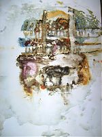
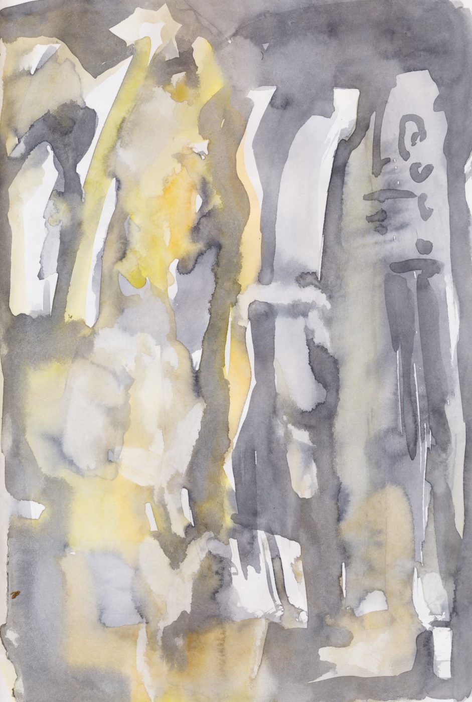
I discovered the first artifact in the lower right corner of the original sheet.
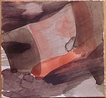
I picked up this treasure and turned the small section into a print file in DIN A1 format, available at malamadita.de, my new shop. What made me choose this section? It certainly has something to do with the composition, colors, and structures. But what exactly, I asked myself, and started a watercolor project, using these finds from my blue sketchbook as a loose template and tracing their shapes and colors.
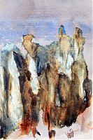
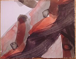
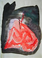
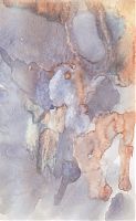
This is not about copying, and why should it be? The prints speak for themselves. Where will I incorporate differences, what will I include, and how will the watercolor work stand out from the giclée print? How will I perceive the comparison, which angles, shapes, and colors of the original artifact convince me more than my own interpretation? Surprisingly, when I compare them, it becomes clear to me that the print conveys a strong spatial impression.
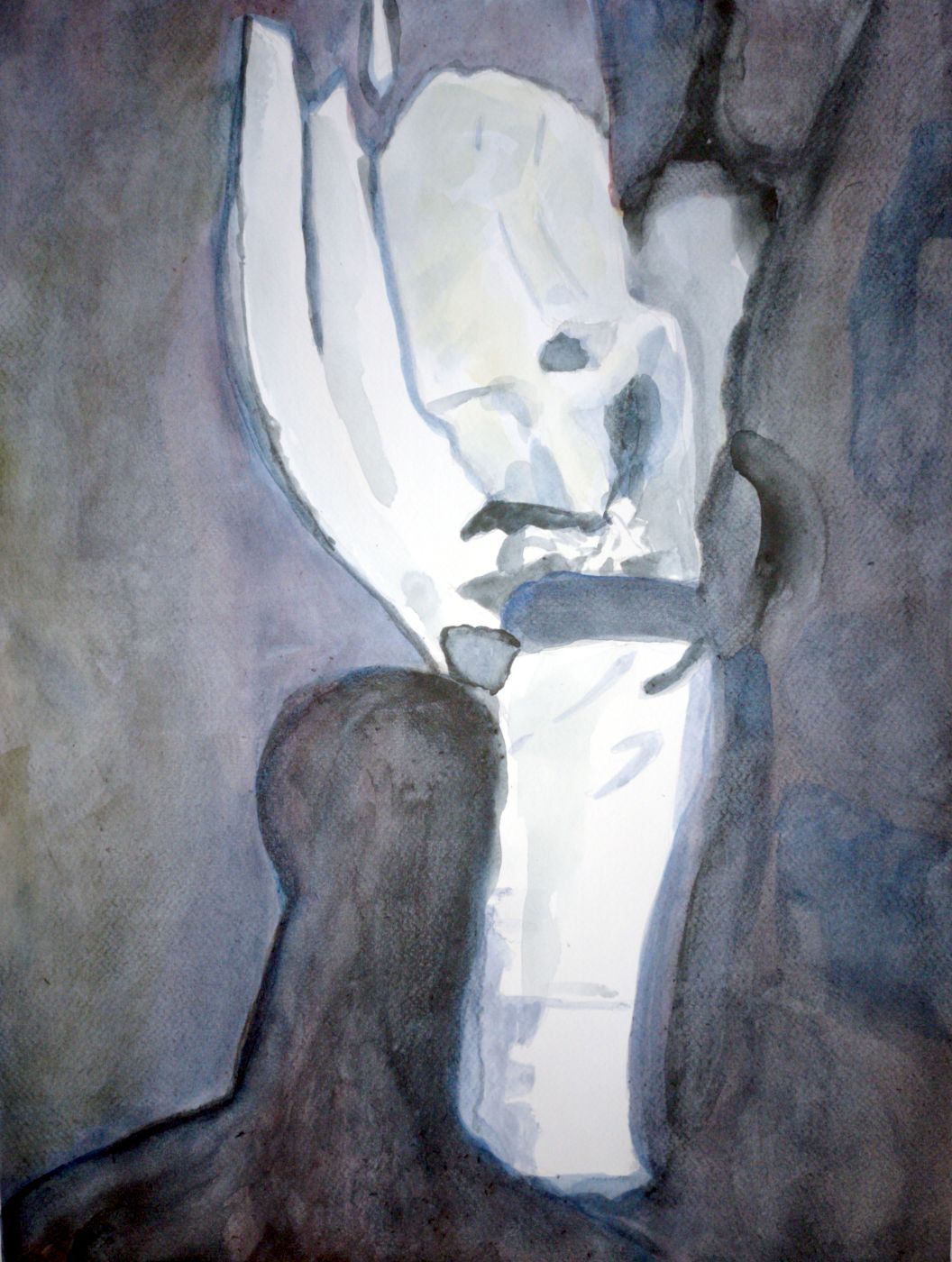
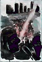
The background is lighter and atmospheric. The white “structure” in the foreground derives its spatiality from the shadowy, dark shape on its left. A white wing rises up as if mounted on a display cube. Next to it, tiny, something crystal-like seems to stand on a thick, dark base.
My first interpretation turns the dark blue background into a chalky, heavy structure. I “closed” the atmospheric, airy background with a darkened shape to make the white forms stand out more. In contrast to the entire background, they now appear more fluid, almost dance-like.
weitere Artikel zum Thema richscribble blaues Skizzenbuch